3. Time Series Actions
In the context of the TOAR-II dashboard, time series actions refer to operations you can perform with or on time series data, such as:
Plots: display various types of data plots (e.g., ozone concentration over time).
Metadata: Retrieve all information for the time series.
These actions are accessible via the dashboard’s interface after you have selected specific stations (like the German stations “Bottrop-Welheim”, “Bielefeld-Ost”, and “Aachen-Burtscheid” shown in the next image).
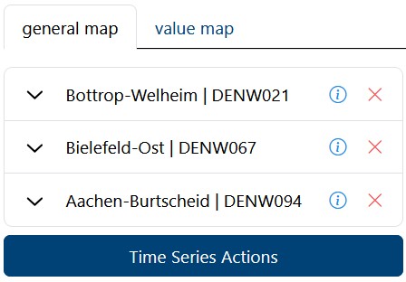
After you have selected at least one station, the button “Time Series Actions” is available in the left column of the dashboard.

This window appears after you have selected specific stations and clicked “Time Series Actions.” Its purpose is to let you choose specific datasets to create a plot or retrieve their metadata.
3.1. The Data Table (Selection Area)
The main part of this popup is a table listing available data records for the stations you previously selected.
Checkboxes: On the far left, there are checkboxes. You can click these to select specific datasets to include in your final graph.
Columns:
Variable: Shows what is being measured (e.g., “2 metre dewpoint,” “CO” for Carbon Monoxide, “Humidity”). Note: While TOAR focuses on ozone, it aggregates various air quality and meteorological variables.
Resource Provider: Shows where the data came from (e.g., ECMWF - European Centre for Medium-Range Weather Forecasts, EEA - European Environment Agency, UBA - German Environment Agency).
Station Name/Code: Confirms the location of the data.
Start Date / End Date: Shows the range of data availability for that specific record.
3.2. Top Filters
If there are too many rows (in the example, there are 126 total, but this page shows 10; you can browse through the pages with the arrow buttons), you can narrow down the list using the dropdowns at the top:
Variable: Filter to show only specific pollutants (e.g., only “Ozone” or only “CO”).
Provider: Filter to show data from a specific organization.
Station: Filter to focus on a specific location if you want to ignore the others.
3.3. Daterange Filter
Below the table, there is a Daterange selector (Start date to End date).
This allows you to cut off the daterange. For example, if you only want to analyze data from 2020 to 2022, you would set those dates here.
3.4. Visualization Options (The “Plots”)
Below the date range, you see four preview thumbnails. These represent the different ways you can visualize the data.
3.4.1. Combined Plot
This overlays all selected data series on a single graph (good for comparing trends directly).
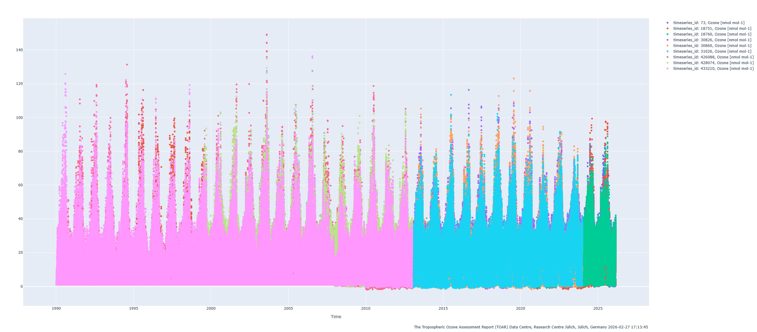
This plot is an interactive plot, which means that you can zoom in or watch the exact data values by hovering over a data point.
3.4.2. Separated Plots
This stacks the data into separate horizontal rows (good if the values vary wildly in scale).

This plot is an interactive plot, which means that you can zoom in or watch the exact data values by hovering over a data point.
3.4.3. Quality Control Plot
This visualizes the data accompagnied with its data quality flags (useful for checking if the data is reliable).

This plot is an interactive plot, which means that you can zoom in or watch the exact data values by hovering over a data point.
3.4.4. Data Summary Plot
This is a summary view, including a map and a statistical overview.

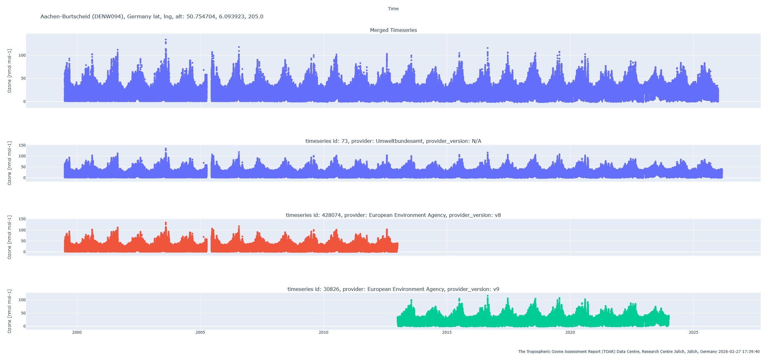
3.5. Special Action: Plot merged timeseries
A merged time series is a composite time series generated from yearly statistics stored in a separate table of the database. It combines data from different providers at the same station to address gaps where no single provider offers continuous coverage.
The merging process follows these rules sequentially for each year:
Start with the provider having the highest order. If its coverage is ≥ 75%, use it.
If coverage is < 75%, check the next provider. If its coverage is at least 20% higher than the first, use the second provider.
Continue until a provider satisfies the condition or all are checked.
Note: The merging is only done on measured data. There will be no mix of measured and modelled data.
The result of the merging process can be visualized by the action button “create plot (merged timeseries)”.